5 Tips for Designing a Lead Capturing Landing Page
Updated March 25, 2022
7 min read
Landing pages are some of the most important parts of your lead generation strategy because they connect your customers’ needs with the products and services offered by your business. Unlike other pages on your site, as blog posts are meant for education, your landing pages need to be designed to facilitate a sale and drive conversions.
Converting customers through your landing pages is easier said than done, though. Your landing pages must limit distractions and maximize how many leads you capture, so make sure they are concise and straightforward. You almost need to make smart design choices to increase customer engagement and make your offer more enticing.
Here are five tips for designing a lead-capturing landing page that works.
1. Always provide a strong call to action
Calls to action, or CTAs, are phrases or buttons that guide the user on how to take the next step with your business.
They can boost your landing page’s conversion rate when relevant and well-placed. They should also make your message crystal clear and take the guesswork out of what your potential customer should do next.
Here are some ways to make your calls to action stand out on your website:
- Create a sense of urgency with a countdown timer to encourage customers to act now.
- Make the CTAs stand out from other landing page elements so they don’t get lost in the background colors.
- Use design elements to make them clickable so customers can engage with them on mobile devices.
- Personalize your CTAs to connect with your audience.

Remember, your calls to action should “call” your visitors and entice them to convert. For inspiration, take a look at FreshBooks’ landing page for free invoice templates, and they use a great CTA of “Create My Free Invoice” to encourage potential customers to engage with their brand.
This accounting software company uses contrasting colors to make their CTAs stand out against the simple page design, and you can use the same approach to draw the attention of your audience and drive them to click on your CTA buttons.
Notice that they have chosen green for their buttons, which is a color that is eye-catching and represents money. The language on the buttons is also direct. Clicking on the more prominent button will allow users to create their free invoice, which is the offer they are here to claim. This drives conversions and makes it easier for users to find what they are looking for.

Another great example comes from Venngage, which uses a strong CTA of “Make An Infographic” right at the top of the page to drive user engagement. This design company offers a free infographic maker in addition to multiple tiers of service options. To generate leads, they require users to sign up to use their free tool, which will allow Venngage to collect email addresses for their marketing campaigns, increasing email conversion rates.
As you can see, the buttons are bright and stand out from the background colors. This means they are bright, clickable, and tell the users exactly how to move on and accept the offer. The page design is simple and only contains essential information, so customers can’t get lost or sidetracked as they read the page, either.
When designing your landing page, make your CTAs as eye-catching and straightforward as possible. Don’t clutter your page with graphics. Ensure your calls to action are obvious and connect with your color scheme.
2. Create a space for social proof
When customers are about to make a purchasing decision, they want reassurance that the product or service delivers. So, they’ll want proof from other buyers to ease their minds before spending their money.
Social proof is an essential component of any digital marketing strategy. It’s vital for boosting your conversions because it shows worried customers that people just like them have been satisfied with their purchases.
In turn, social proof will assure them that their experience will be similar. There are lots of different types of social proof you can display on your website, such as:
- Reviews and testimonials to gain the trust of potential customers
- Media mentions establishing credibility in your industry
- Awards and qualifications to show that you are an industry leader
- Highlighting well-known clients to build a connection with potential customers
To gather social proof, you’ll have to ask your customers for reviews after they have used your products or services for some time. Make requesting reviews a part of your follow-up process and consider offering an incentive. For example, customers who leave reviews could receive a 10% off coupon for their next purchase.
Reach out to industry influencers and repeat customers to promote your products, too. These reviews and testimonials will go a long way towards improving your conversion rate. Also, gather your industry accolades, certifications, and media mentions to include. These prove you are a leader in your industry and build credibility.
Displaying social proof is just as important as gathering it: it’s what helps you capture leads. Place short testimonial videos or quotes from positive reviews on a carousel at the top of your landing page, for instance.
Don’t forget to include graphics that represent the awards and accolades you’ve received, as well as the logos of famous brands that endorse your product or service. But remember, don’t overcrowd your landing page or your CTAs will get lost.
At Loganix, we include an excerpt from a positive testimonial on our Google Ads management page, along with a link to our collection of expansive social proof, on key pages of our site. Our designers knew that we needed to highlight positive customer experiences to drive more sales, so they made sure our customer feedback would stand out and be the main focal point.
If a user clicks on “read more testimonials”, they will land on a collection of video clips and reviews that further explain the positives of partnering with Loganix. They do a great job of proving to their readers that Loganix is a credible company with a lot to offer.
You can use the same approach on your landing pages by curating the best of your customer feedback, case studies, and testimonials to prove to potential buyers that your company is worth buying from.
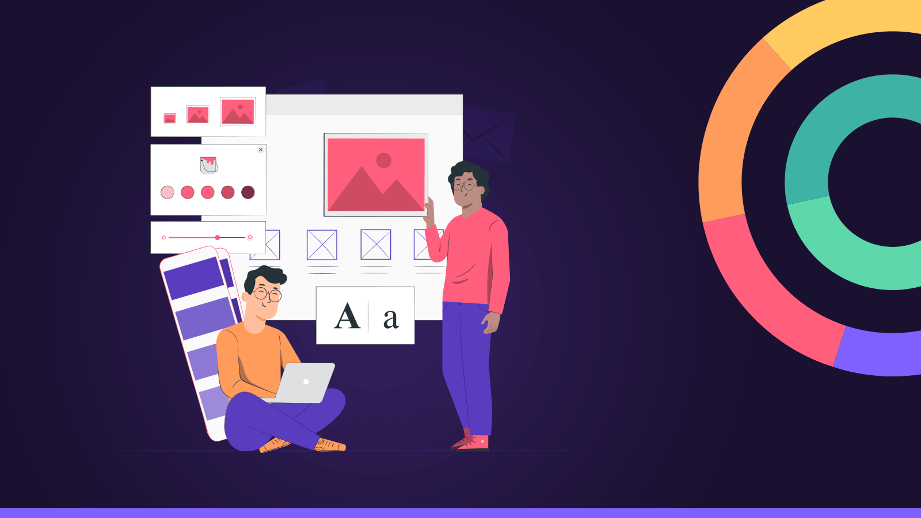
3. Use imagery that shows what your business is all about
Imagery is very effective for helping customers feel more connected to your business, excited about your products, and tempted to make a purchase.
Along with testimonials and a simple design, you will also want to use compelling imagery that shows your business in the best light. There are many routes you can take with this. For instance, you could:
- Use product imagery that shows how items work
- Use images of your staff members to humanize your business
- Create illustrations or diagrams that help customers better understand what you do
Showcase imagery of people who represent your customers to make them feel welcome.
Don’t go crazy with the visuals, and be sure to only use images when needed and when they serve a specific purpose in the landing page design.
Let’s take a look at an example of a company that always gets its landing page imagery right to provide you with some inspiration.

Smith.ai, a company that offers a 24/7 answering service for other businesses, uses eye-catching imagery to connect with its audience. The image they have chosen exudes positivity and professionalism, which is essential for their target audience and industry.
The image clearly shows a happy and productive virtual receptionist. This further establishes trust with potential customers that real receptionists staff the services, will provide an excellent experience for callers.
Always choose images that communicate the message that represents your brand, like Smith.ai has.
4. Ensure your contact details are clearly signposted
If prospective customers have a question or concern, they’ll want to get in touch with your landing page. If it’s challenging to do this, they’re likely to leave without making a purchase.
This will cause you to lose leads and potentially impact your sales numbers. It’s essential to have several contact options on your landing page like an email address, phone number, and even live messaging.
When you offer multiple ways to reach out, your customer can choose the option that suits them best. For example, customers in a hurry may prefer to email rather than make a phone call. Or customers with important questions or concerns may want to speak to a real person right away. Offering multiple content channels will improve your UX and build credibility.
5. Keep your landing page design simple
Minimalism is the key to a good landing page because every element you add increases the risk that your audience will miss your CTAs or get distracted while viewing the page. While your landing pages need to be attractive and present information to your readers, they need to accomplish these goals in a non-intrusive way.
Too many visuals and too much text can sidetrack your potential customers and prevent them from finding your CTA. Plus, you don’t want to risk people getting distracted or feeling overwhelmed, so it’s best to stick with offering the most crucial information and page features with a few eye-catching visuals.
Choose a plain background and brand-aligned color palette. Check out the host sign-up page for Airbnb. Their landing page is very straightforward.

It uses high-contrast colors, minimal text, and an engaging animation of visuals to entice the reader to click on their CTA. Notice how the bright CTA button draws the eye, making it easy for visitors to click.
When designing your landing page, consider the most critical information you need to communicate within the visitors’ direct line of sight, and don’t overload your page with text.
Remember, minimalism is key when it comes to landing page design! A simple page will also load quickly, which prevents your users from giving up and moving on to your competitor’s site.
Summary
Landing pages offer unique opportunities for your business to create welcoming and customer-centered marketing campaigns that drive conversions. For your landing page to do its job, it needs to be correctly designed.
Are you looking for more ways to boost your ROI? Check out the articles on Emailable for more expert tips and tricks that will drive conversions and attract more customers.